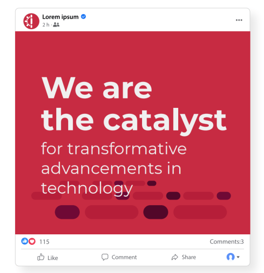
We designed a brand suite to support Impedans’ internal team as they launched their evolved brand, both internally and with their clients.
It was important to Impedans to keep certain elements of their brand in place, as some long-term applications, like manufactured products, couldn’t be easily updated. They also wanted to introduce a pinkish-purple color to their palette that would make it clear to those in their industry what sort of plasma they worked with. We merged this color with their existing deep red, and created a graphic language that speaks to the technology they work with. We also adapted their existing logoform to make it more modern, speaking to the cutting-edge technology they work with.


We designed a brand suite to support Impedans’ internal team as they launched their evolved brand, both internally and with their clients.
This included a corporate identity kit which includes guidelines on how to apply the brand consistently across applications. We also provided marketing materials to aid in the initial roll-out. In additon to this, we worked closely with Impedans to design and develop an updated website, in line with their updated brand visuals, refining their brand language and taking Impedans into a new era!

