Wriggle Learning are a leading provider of technology devices, innovative training and IT support for schools and colleges. They needed a distinctly designed, modern and friendly brand that reflected their forward-thinking approach to education.
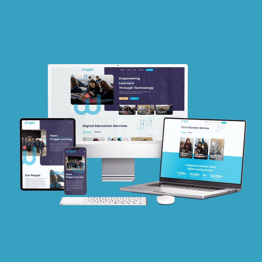

Wriggle Learning wanted to transform their brand to reflect the company’s growth and its commitment to well-established core values. The brand look and language needed to resonate with their key personas, which included decision-makers within schools, parents of school-aged children, and college-level students. They wanted to communicate both friendliness and a commitment to modern education methods.
This updated brand look and language then needed to be applied through a website, as well as digital and offline branded materials. As their brand team, we were best placed to consult with them to create those branded applications, and to work closely with them to ensure the brand launch was seamless and well-received by their large customer base.
We undertook an in-depth workshop with key Wriggle Learning stakeholders to help us understand their business goals, their brand values, and key customer cohorts. We then undertook a competitor analysis to understand where there were opportunities to differentiate their business in the market.
This workshop guided our brand design, which is a thoughtful and narrative-led process, led by our understanding of their brand pillars and values. For the brand logomark, we created a stylized ‘w’ in an ascending form, to denote positive and progressive learning. The three dots above in the logomark represent their key cohorts of learners, parents and teachers. In order to maintain a connection between their pre-existing brand look and the updated look, we kept the rounded form of the letters in the brand logotype.
Establishing the narrative behind the brand is an essential part of our process, ensuring that key stakeholders feel that their business is well-represented in their brand and that the brand has unique meaning. With the foundation established, we expanded out the brand colours and typography, with a graphic language of patterns, forms and illustrations linked back to the primary ‘w’ monogram.


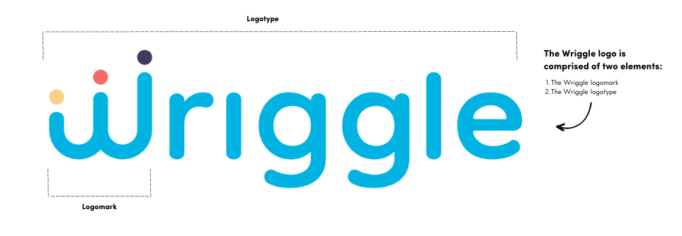
Working closely with the Wriggle Learning team, we established a brand identity, supported by an in-depth Corporate Identity Guide, a suite of brand logos, patterns and illustrations, and a Culture Code deck to ensure that the brand is applied consistently across applications.
We applied the brand to a new website, and also updated their existing online and offline promotional and educational materials to ensure the brand launch was comprehensive and successful.
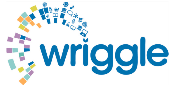
Before

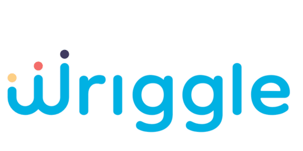
After